On this page...
- How Can HEI Scores be Displayed Graphically?
- Steps for Creating a Radar Plot
- Interpretation of HEI Scores: Grading
How Can HEI Scores be Displayed Graphically?
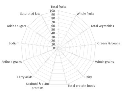
When using the HEI, it may be helpful to visualize its multidimensional qualities using a radar plot such as the one shown below.
A radar plot displays information about each component score simultaneously. The outer edge of the “wheel” (or end of the “spoke”) represents a score that is 100% of the maximum score for that component. The center of the circle represents a score of 0% of the maximum score for any component (see Figure 1).
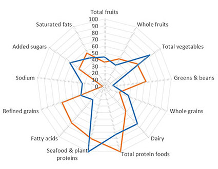
Looking at the collection of component scores in this way may help those using the HEI to visualize patterns of dietary intake and compare differences in diets that may have similar scores overall but different component scores (see Figure 4).
It is important to display the components on the radar plot in the same order each time so that visual comparisons can be made. The suggested order of components is: Total Fruits, Whole Fruits, Total Vegetables, Greens & Beans, Whole Grains, Dairy, Total Protein Foods, Seafood and Plant Proteins, Fatty Acids, Refined Grains, Sodium, Added Sugars, and Saturated Fats.

Figure 1. Blank radar plot with no data plotted. For each component, the plot is showing the percentage of total points received, starting with 0% in the center and 100% at the outer edge.

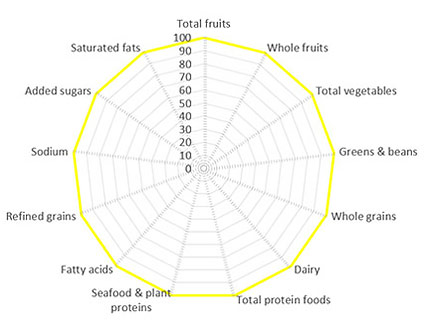
Figure 2. Radar plot showing a perfect score of 100. All components scored perfect scores (100% of possible points).

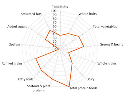
Figure 3. Radar plot showing 2010 U.S. food supply data. The total score is 50.9. However, one component received a perfect component score, Total Protein Foods, while Sodium scored near 0 points. Visualizing the HEI scores in a radar plot allows a viewer to see which components are contributing to the total score.

Figure 4. Radar plot showing two similar total HEI scores (50.9 vs. 49.3). Though the scores are similar, there are notable differences in variety of protein foods, with one scoring perfectly in Total Protein Foods but lower in Seafood & Plant Proteins, compared to the other scoring perfectly in Seafood & Plant Proteins but lower in Total Protein Foods. Similarly, large differences in component scores between the two plots in the Greens & Beans and Fatty Acid Ratio categories can be visualized with this radar plot comparison.
Steps for Creating a Radar Plot
To create a radar plot in Excel, follow the steps below starting with your blank worksheet.
To create a radar plot directly in PowerPoint, navigate to Insert and select Chart -> Radar, and click OK. The slide will show a radar plot and will open an Excel worksheet that can be edited by following the steps below.
Step 1
Key in the data you wish to plot in the radar plot. It works well to type the component names in column A and add headers in row 1 describing what is being plotted (e.g. Quintile 1, Cluster A, etc.)
*Note that the order that you type the components determines the order that they appear on the circle of the radar plot. The authors of the HEI have recommended that components appear in the same order so that plots can be compared more easily. The recommended order is noted in the table below.
Step 2
Set up the spreadsheet to calculate the component scores as percentages of the total maximum score for each component. (For reference, for HEI 2015, these scores are listed in Step 3 below). The equation in each cell should be =(X/Y)*100 where X = the component score from your sample and Y = the maximum score for that component.
Step 3
Navigate to the Insert menu and select Recommended Charts and then pick the All Charts tab to select the chart called Radar.
*Note if your radar plot does not have radial axis lines (the “spokes” of the plot), and you would like them to display, try changing the plot to a Radar with Markers or a Filled Radar by right clicking and selecting Change Chart Type. On the new plot, find Add Chart Elements (in some Excel versions, do this by clicking on the plot and select the plus sign icon) and selecting More Options from the Axis line. In the new menu that opens, under the Axis Options tab, click on the Fill & Line icon (this icon looks like a paint can), find the section for Line, and select Solid line.
| COMPONENT | MAX SCORE |
|---|---|
| Total fruits | 5 |
| Whole fruits | 5 |
| Total vegetables | 5 |
| Greens & beans | 5 |
| Whole grains | 10 |
| Dairy | 10 |
| Total protein foods | 5 |
| Seafood & plant proteins | 5 |
| Fatty acids | 10 |
| Refined grains | 10 |
| Sodium | 10 |
| Added sugars | 10 |
| Saturated fats | 10 |
Interpretation of HEI Scores: Grading
A graded approach can be used to aid interpretation of the HEI scores. The letter grade should not be reported alone, it should only be reported in combination with the numerical score. The grading system is as follows:
- Overall scores of 90 to 100, or component scores that are 90% to 100% of maximum score: A;
- Overall scores of 80 to 89, or component scores that are 80% to 89% of maximum score: B;
- Overall scores of 70 to 79, or component scores that are 70% to 79% of maximum score: C;
- Overall scores of 60 to 69, or component scores that are 60% to 69% of maximum score: D; and
- Overall scores of 0 to 59, or component scores that are 0% to 59% of maximum score: F.
Furthermore, we do not recommend using letter grades as a way of categorizing scores for subsequent analyses because translating scaled data into categories discards useful information. Also, given the variability in diets, misclassification can occur, especially affecting scores at or near cutpoints.
Additional information on interpretation of HEI scores utilizing grading can be found in the following publication:
Krebs-Smith SM, Pannucci TE, Subar AF, Kirkpatrick SI, Lerman JL, Tooze JA, Wilson MM, and Reedy J. Update of the Healthy Eating Index-2015. J Acad Nutr Diet. 2018 Sep;118(9):1591-1602.